Creating a Pixelart Icon Pack
Initial motivation
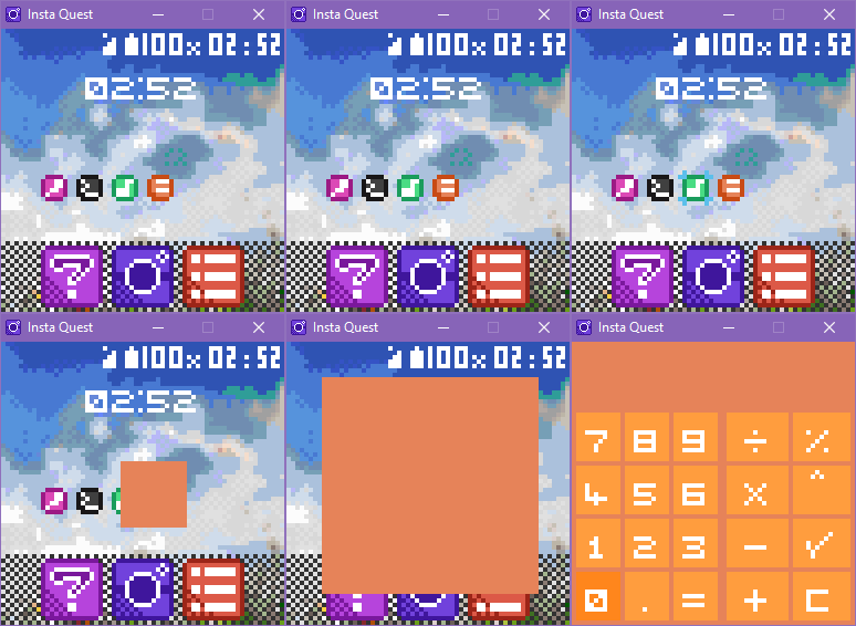
A few months ago, I created a game that simulates a smartphone at a really low resolution, 64x64 to be more specific. This resolution is a restriction of the well-known LOWREZJAM.
So the game was about a SNS app for photos like Instagram and I decided to simulate a mobile launcher just for the aesthetics. I created all the icons and added a base for the pseudo applications (I also added a fully functional calculator app for no reason). In the end, I was surprised because the result turned out to be very cute.

Since then I wanted to create a pixel art icon pack for Lawnchair (my current/favorite launcher), but I could not because it was a bit difficult to create an icon pack for Android, mainly because I have almost zero knowledge about Android development.
I’ve tried forking some open-source icon packs such as the Theia Icon Theme (available on F-Droid), but their build scripts/settings did not work for me.
A few months went by and I found another icon pack on F-Droid, the MBE Style. It’s a super cute icon pack made by Chinese developer/artist.
I started using it on my phone, then when I had some free time I tried to build it from the source code and the build was successful.
Trends in icon design
When I was creating the game, I did some experiments using the 16x16 and 8x8 sizes. I decided to fake a design trend based on an (in)famous trend: the long shadow trend.

This trend is somewhat controversial because the shadow can be a problem in the result, it can pollute the icon and be an unnecessary element at times.
The advantage of this trend is that it’s easy to resemble mobile apps, so that’s the reason why I’ve tried to fake a design trend based on it.
Guidelines
I defined some restrictions for the icons:
- Only 2 colors + white are allowed.
- Using 3 colors is mandatory.
- White can’t be used in the background or borders.

These restrictions worked well for all icons in the game, so I tried to keep them for the icon pack.
I also tried to do some experiments with colors using the Google icon (because the original icon has a white background).

Results
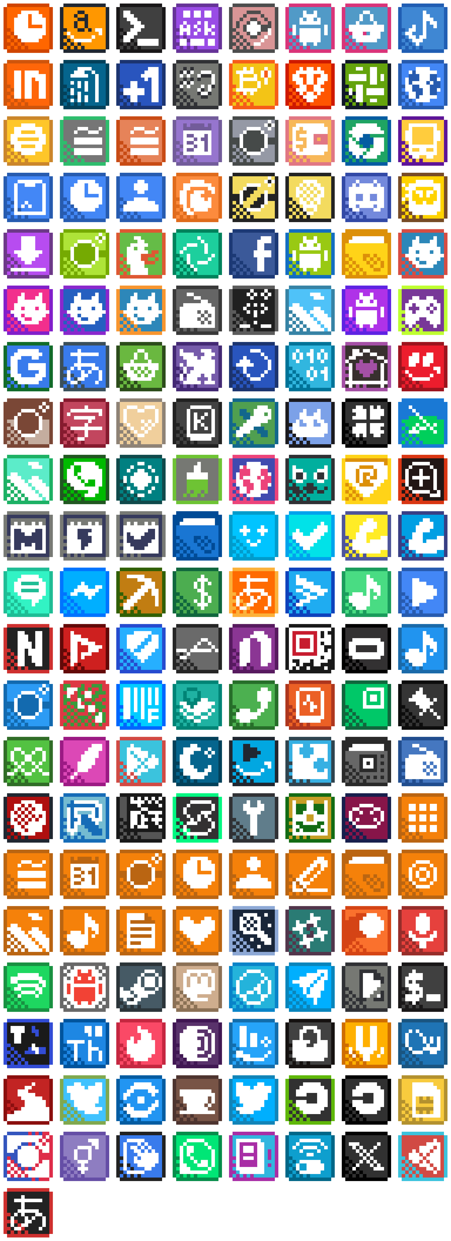
Despite some difficulties with some icons that have many details or have white backgrounds, I’m enjoying the results for now.

You can follow this project on GitHub!
- GitHub: PixelStyle
- Apk: Pre-releases
Comments